William Turnbull 1922-2012
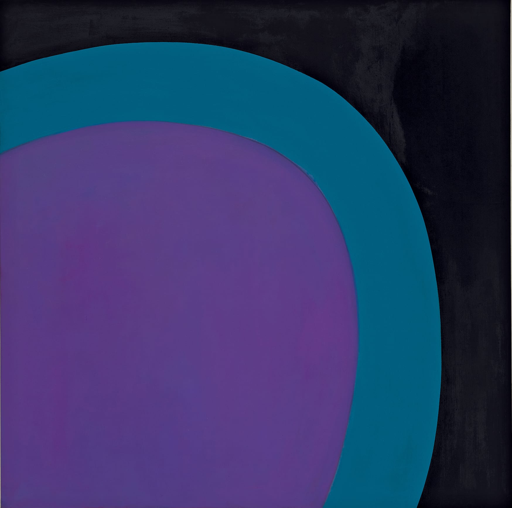
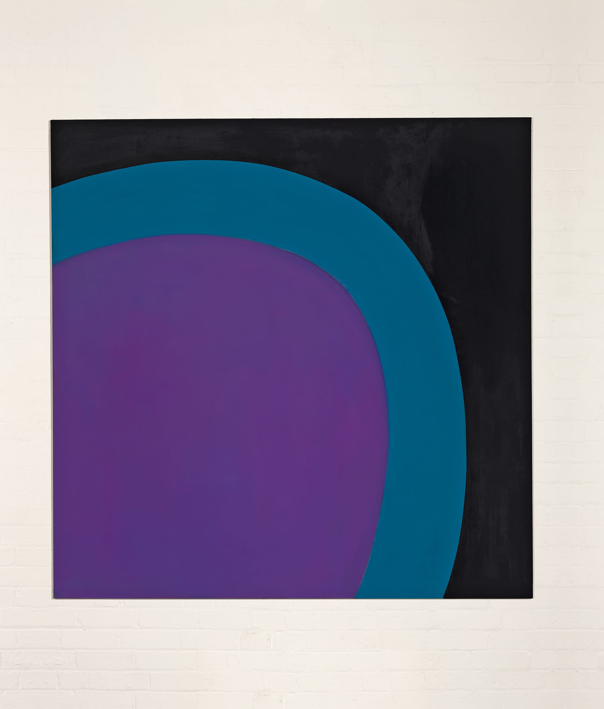
14-1960 (Mauve Swell), 1960
oil on canvas
70 x 70 inches
177.8 x 177.8 cm
177.8 x 177.8 cm
signed twice, dated and titled and dated verso
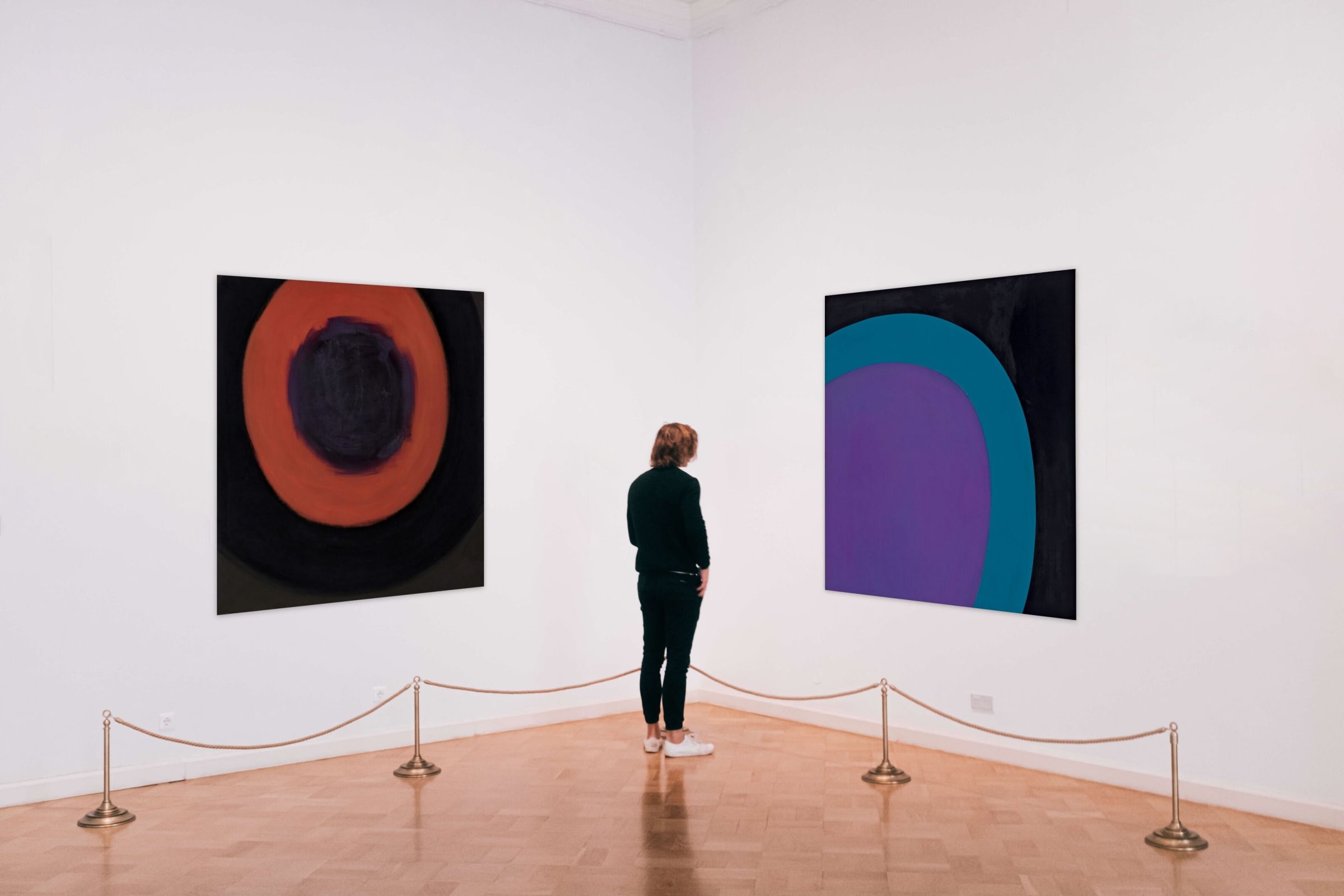
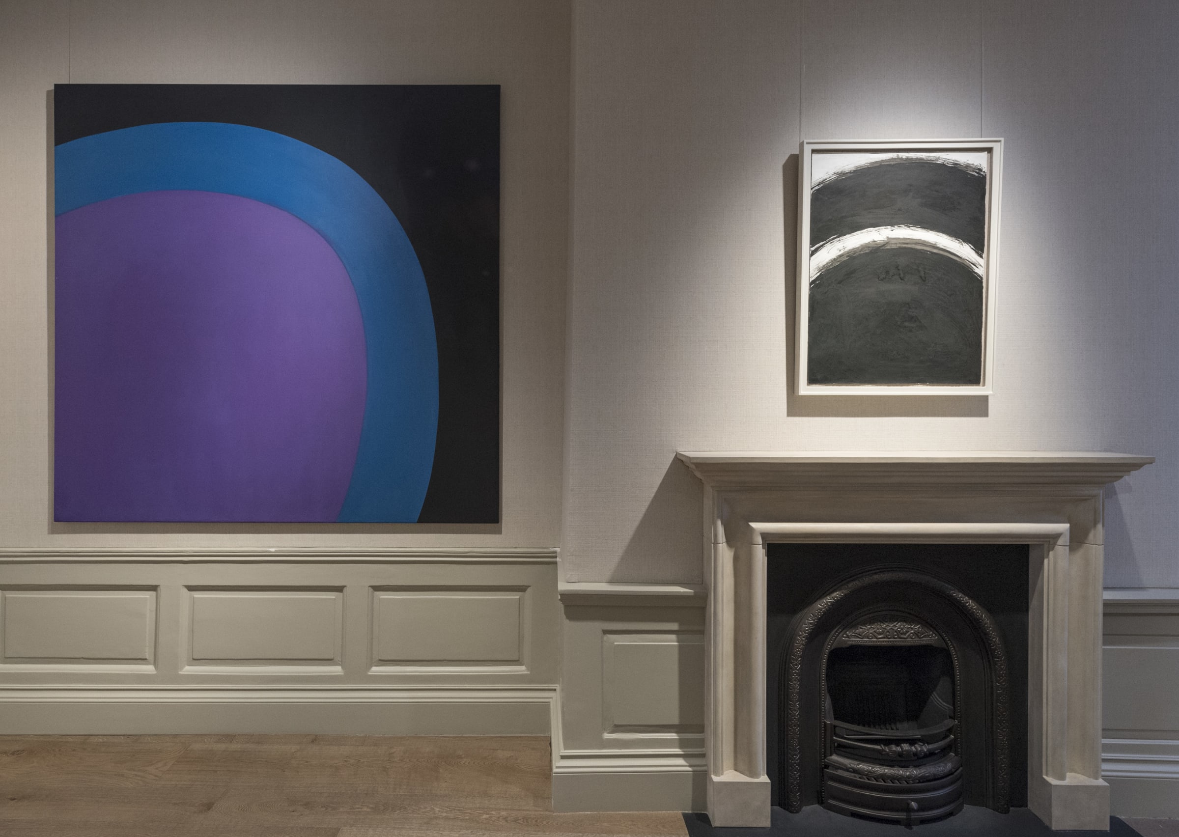
Further images
While perhaps currently better known as a sculptor, in fact William Turnbull enjoyed critical success within both painting and sculpture, working across both disciplines throughout his career. His first solo...
While perhaps currently better known as a sculptor, in fact William Turnbull enjoyed critical success within both painting and sculpture, working across both disciplines throughout his career. His first solo exhibition, at the Hanover Gallery in 1952, showed paintings alongside sculptures and he continued to exhibit in this way, including at his retrospectives at the Tate Gallery in 1973 and the Serpentine Gallery in 1995-6.
In the mid-1950s Turnbull’s paintings took as their starting point the human head, the image emerging from a series of gestural marks, these were to become increasingly abstracted and showed an affinity with Art Brut. He was amongst the many British artists inspired by the ambitious and large-scale Abstract Expressionist paintings shown in Modern Art in the United States at the Tate Gallery in January - February 1956. In early 1957, Turnbull visited New York for the first time, where the collector Donald Blinken introduced him to a circle of American artists, including Mark Rothko and Barnett Newman, with whom he maintained ongoing friendships. Even before his trip, Turnbull had begun to make monochrome paintings and from this point on, he rejected figurative imagery, and even notions of shape, in order to create paintings based on pure sensation, in which the act of painting and the experience of the viewer would be as direct as possible.
Between 1957 and 1962, we see Turnbull experimenting widely with expansive fields of colour – he produces paintings of a single colour bordered by thin bands of other hues, sometimes he adds a wide band at the bottom, sometimes a thin channel of opposing colour bisects the picture, and occasionally he employs more gestural marks, floating in squares (see for example No.1, 1959, Tate Gallery collection). There are also a number of paintings in which Turnbull places two tones of the same colour (often red and dark red), side by side, vertically, or, as we see in 14-1960 (Mauve Swell), one colour curving around another.
In 14-1960 (Mauve Swell) the edges where the three colours meet are not sharply defined, but pleasingly soft and imperfect. There are similar compositions from 1960, in which Turnbull uses tones of the same colour, but here a light, turquoise-blue curves over a lilac-mauve, the mauve seeming to push up against it, as the title suggests. The gentle, forward slope of the form adds to the suggestion of movement, or perhaps more accurately the potential for movement. The addition of black heightens this dynamic effect, and this simple motif is imbued with energy.
This curving motif can be traced back to the mid-1950s Head paintings. By the late 1950s, the notion of the head is gone but the circle remains, as we see in a series of gestural works on paper from 1959 in which the circle gradually migrates to the outer edges of the paper until it is just a curve. Here, Turnbull’s paint is thinly applied, retaining the texture of the canvas beneath. In 1961, Lawrence Alloway explained:
‘Materiality in painting has often been identified with the weight of painting lying thickly on the canvas. To Turnbull, however, like Rothko in this respect, materiality is a function of the ground itself. His colour is flat and bodiless as a dye, so that the tangibility of the canvas surface itself is preserved. The luminosity of his colour thus appears to emanate from the surface: it does not… dissolve the surface.’ 1
Note: From the early 1960s Turnbull titled his paintings with a code, denoting the order in which it was painted and the year. Occasionally, as we find here, Turnbull adds his own more descriptive title, see for example Negative Green, or the pair of pictures from 1959 (of which the Tate’s is one) which are subtitled Ying and Yang. We might conclude that this is the 14th painting Turnbull made in 1960, however it is not clear how many paintings he destroyed as he went along, so while his estate also includes a painting titled 20-1960, the notion of 20 paintings does not necessarily correspond to his commercial output.
1 introduction, exh. cat., William Turnbull, Molton Gallery, London, 1960
Provenance
Estate of the Artist