
William Turnbull 1922-2012
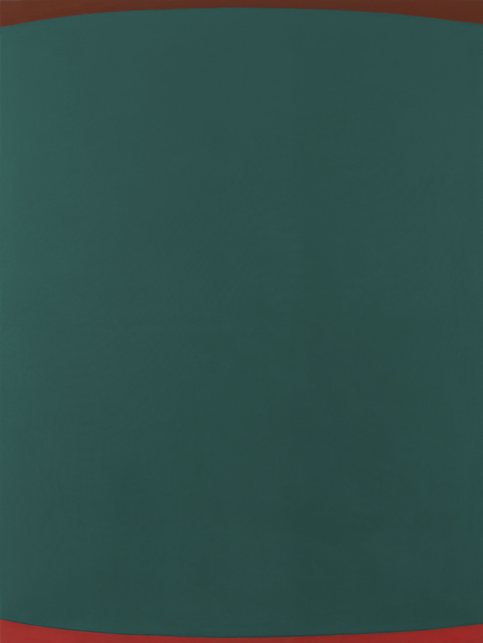
Negative Green, 1961
oil on canvas
80 x 60 inches
203.2 x 152.4 cm
203.2 x 152.4 cm
signed (twice) and titled once on the overlap
Further images
‘I do not consider myself a ‘hard-edge’ painter, nor am I concerned with geometric abstraction. I am concerned with the canvas as a continuous field, where the edge created by...
‘I do not consider myself a ‘hard-edge’ painter, nor am I concerned with geometric abstraction. I am concerned with the canvas as a continuous field, where the edge created by the meeting of coloured areas is more the tension in a field than the boundary of a shape’. 1
William Turnbull is a rare example of an artist who excelled as both sculptor and painter. While he is perhaps currently better known for his sculpture, in fact he worked across both disciplines throughout his career, his first solo exhibition to include paintings was at the Hanover Gallery in 1952. In the mid-1950s Turnbull's paintings concentrated on the motif of the human head - this central image being built up from a series of gestural marks or block-like brushstrokes. He was amongst the many British artists who saw, and could not ignore, the ambitious and large-scale Abstract Expressionist paintings presented in Modern Art in the United States at the Tate Gallery in January - February 1956. In early 1957, Turnbull made several almost monochrome paintings, just prior to his first trip to New York, where the art collector Donald Blinken introduced him to a circle of American artists, including Marc Rothko and Barnett Newman, although Turnbull did not visit their studios until the early 1960s. From this point on, Turnbull abandoned figurative imagery, and even notions of shape, in order to create paintings based on pure sensation, in which the act of painting itself and, in turn, the experience of the viewer, was as direct as possible.
In the exhibition catalogue accompanying Turnbull's solo exhibition at the Tate Gallery in 1973, Richard Morphet explains that the artist's aim was: 'to potentialise a single colour surface without making shapes or compositions, and to give the spectator an experience which was highly particular, without the painting being perceived as simply an object. He tried to use colour in such a way that it would be difficult to attach to it any figurative associations'. 2
Between 1957 and 1960 we see Turnbull experimenting widely within these parameters - his paintings typically structured around one dominant colour. There are paintings which have a distinctive texture produced with a palette knife (2-1957), and some which have more explosive, gestural marks (5-1958); often the compositions are structured by thin vertical lines (7-1958), which echo Turnbull’s upright totemic sculptures, or they have wide bands of another colour at the top or bottom of the painting (23-1958).
The simple frontality of Turnbull’s paintings of the human head directly inform these newly abstract images. The notion of head is reduced to a loose gathering of gestural marks, or is simplified to a circle; these circles later expand in scale and migrate out to the edges of the painting so that we are left with an image where a section of a circle appears to be ‘pressing’ against another area of colour, as in 20-1960 (Expanding Red) . It is from these very flatly painted oils of 1960 that Turnbull arrives at Negative Green, 1961, in which an unmodulated area of viridian green ‘pushes outwards’ at two slim curves in different shades of red.
By the end of the 1950s Turnbull’s paintings are usually monochrome with slim curves, or borders, of an opposing hue. In the Tate Gallery’s painting No.1, 1959, for example, Turnbull uses a field of yellow, surrounded by a thin, red border. Later, we find these slivers of colour mirrored in Turnbull's sculpture, in the very thin, upright bronzes he began to produce after 1963.
This preoccupation with the outside edges of the canvas, and the emptying out of the centre, is shared with numerous other painters from the period, most recognisably in the paintings of American artists Barnett Newman and Morris Louis, but also in the work of British contemporaries such as Richard Smith - see for example, Billboard, 1961 , painted in the same year, which features flashes of green around a ground of softly painted orange-red.
The surface of Negative Green is typical of Turnbull's early 1960s canvases, which are painted very thinly, appearing more stained than painted. This was achieved by applying dilute oil paint to the surface and then rubbing it back with a cloth - a notably 'sculptural' solution to a painter's problem. As Lawrence Alloway wrote in 1961,
'Materiality in painting has often been identified with the weight of paint lying thickly on the canvas. To Turnbull however, like Rothko in this respect, materiality is a function of the ground itself. His colour is flat and bodiless as a dye, so that the tangibility of the canvas surface itself is preserved. The luminosity of his colour thus appears to emanate from the surface: it does not … dissolve the surface'. 3
Over the course of three interviews given to Tate Gallery curators in 1972, (an invaluable first-hand account of the artist's intentions, given on the acquisition of a painting for the collection), Turnbull explained his thought processes and elaborated on the influence of other artists. He noted that while he admired the paintings of Rothko and Still, he did not wish to emulate the illusory or 'sublime' aspects suggested by their painting. Rather he preferred:
'a type of painting in which the material facts of the paint and the flat surface should at all times be strongly apparent and in which the reference should be purely to the artist, the physical painting itself and the spectator…He wanted the process of executing and perceiving a painting to be so concentrated inward, in these ways, so that each painting should assert a 'constant now'…To make his paintings Turnbull necessarily used manual gesture, but his aim was to make with it something very static and also what he called 'totally silent paintings'.
Turnbull goes on to discuss his admiration for Matisse, Brancusi and above all for Monet's Nymphéas series, a number of which he saw in London in 1957. These paintings became touchstone works for Turnbull, reaffirming his belief that:
'the central concern of painting must be with painting itself, rather than with images and symbols'.
Finally, he describes in more detail how he perceives colour to be acting in his paintings. He conceived:
'...any single picture as a colouristic whole. Though a picture might contain contrasting colours, he tended to think of each work as being of a particular hue. He wished to avoid creating an animation among the colours within a work. He never used a colour to balance one already set down, and he never added a colour in order to resolve a picture as a colour harmony. Some of his paintings of this period, were, indeed, made of a single colour. Turnbull considered that the colour complementary to that of any basically monochromatic painting was provided by the viewer, within his own perception of the work (what Turnbull called 'subliminal complementaries'). Thus, his reaction when anyone looking at a monochromatic work-in-progress suggested that it called for a complementary hue, was to add more of the colour it already had.'
'Usually when complementary colour was used, it was in an entirely distinct work. The Tate's No.1, 1959, which features yellow with a red border, is in this sense the complementary or companion painting to 28-1958, which is dark purple with a white border. Originally titled 'Ying' (sic) and 'Yang' the titles related to Turnbull's deliberate presentation, in these two works when seen together, of the opposition and complementarity of two principles, darkness and light.' 4
The sombre, yet magnetic atmosphere conveyed through this viridian green, echoes Turnbull’s other dark-toned paintings, such as the deep violet 28-1958, or monochromes such as Black Painting, 1957, which stand in contrast to contemporaneous works in white, red and yellow. Turnbull’s direct referencing of the Chinese concept of yin-yang, reflects his interest in Eastern philosophy and Negative Green enacts this notion of oppositional forces - in which green would be aligned to female, negative, earth, dark, and cold, and the small flashes of red to the masculine, positive, heaven, heat and light. While Turnbull resisted the notion of one colour ‘balancing’ another, it is interesting to consider how such small areas of bright colour, inflect the much larger field of green so exactly.
Towards the end of 1957, Turnbull began titling his paintings with numbers, denoting the order in which it was painted and the year - Negative Green, is one of the few exceptions to this rule. 5 Here, the title refers both to the use of complementary (opposing) colours within the composition - red with green - and also the potential of the viewer to see, or imagine, the 'opposite' of green. As Turnbull suggested to Richard Morphet, above, the title also suggests this work as the 'negative' of Turnbull's contemporaneous red paintings, for example 11-1961.
1 William Turnbull, ‘Images without Temples’, Living Arts 1, 1963, p15
2 Richard Morphet, William Turnbull, Sculpture and Painting, Tate Gallery exhibition catalogue, 1973, p44
3 Lawrence Alloway, introduction to Turnbull's Molton Gallery exhibition, August-September 1960
4 http://www.tate.org.uk/art/artworks/turnbull-no-1-1959-t01524/text-catalogue-entry
The Tate’s notes on No.1, 1959 were drawn directly from conversations between Richard Morphet on 23 February, 1 June and 9 June 1972
5 The austere, factual titles Turnbull gave to his paintings, are diametrically opposed to the allegorical names he gave his sculptures in the same year, see for example Prometheus and Troy, both 1961.